Graphic Design
'The Office' Infographic
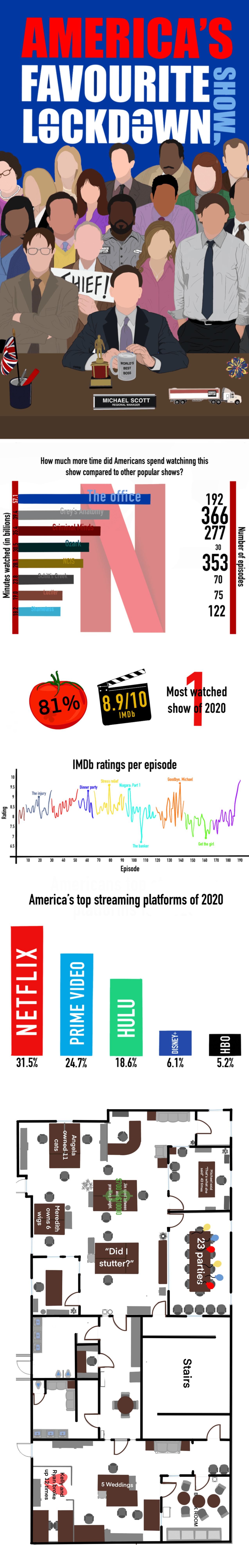
A data‑driven infographic capturing the TV shows Americans watched most during lockdown — merging research and illustration to tell a story of shared escapism. Outcome: Viewed > 2,000 times on social media, praised for clarity and storytelling.
Year :
2022
Industry :
Entertainment
Client :
University project
Project Duration :
3 weeks

LOCKDOWN WATCHLIST – VISUALISING AMERICA’S MOST-WATCHED SHOWS
I began by researching which shows were most popular during COVID‑19 and discovered that The Office (U.S.) was one of the top‑streamed series. Naturally, I re‑watched it — purely for research purposes 😇 — and started sketching ideas on paper.
To ground the design in the world of the show, I mapped out the Dunder Mifflin office floorplan, piecing it together from stills, set references, and fan‑made resources. I annotated the layout with key moments and iconic scenes, creating a sense of narrative and movement within the space.

Alongside this, I explored typography and title concepts inspired by The Office’s branding, incorporating the colours of the American flag to tie in the broader cultural context.
Once the layout and title direction were set, I illustrated each character in Procreate, experimenting with a minimal facial style that relied on shape, posture, and expression for recognisability rather than facial detail.


Fan‑favourite rankings informed the composition hierarchy — placing Michael Scott at the centre, surrounded by familiar props like his desk toys and the “World’s Best Boss” mug.
Each illustration was refined digitally and composed in Illustrator, resulting in a final piece that celebrates both data and fandom through a cohesive, playful visual style.
⭐ Creative Outcomes
Instead of traditional UX metrics, this project focused on visual storytelling, illustration, and communication. Key outcomes include:
Developed a cohesive visual narrative that blends data with character‑driven illustration
Strengthened my ability to communicate complex information through accessible, engaging design
Refined a minimalist illustration style focused on recognisability through shape and expression
Improved understanding of colour, contrast, and accessibility in data‑driven visuals
Enhanced ability to translate cultural references into meaningful design decisions
REFLECTION
This project was a joyful balance of research, creativity, and nostalgia. It pushed me to think critically about how to translate data into storytelling while maintaining visual appeal and clarity. By combining detailed research with playful illustration, I learned how to make information both informative and emotionally engaging.
If revisiting the project, I would:
Improve colour contrast in the Netflix stats area for better accessibility
Refine skin tones for more accurate representation and realism
This project gave me the opportunity to experiment with a new illustration style — one focused on recognisability through minimalism — and to explore how small design details can evoke strong emotional connections with audiences.
Overall, Lockdown Watchlist reminded me that even data‑driven design can have character, warmth, and personality.


More Projects


Graphic Design
'The Office' Infographic
A data‑driven infographic capturing the TV shows Americans watched most during lockdown — merging research and illustration to tell a story of shared escapism. Outcome: Viewed > 2,000 times on social media, praised for clarity and storytelling.
Year :
2022
Industry :
Entertainment
Client :
University project
Project Duration :
3 weeks
LOCKDOWN WATCHLIST – VISUALISING AMERICA’S MOST-WATCHED SHOWS
I began by researching which shows were most popular during COVID‑19 and discovered that The Office (U.S.) was one of the top‑streamed series. Naturally, I re‑watched it — purely for research purposes 😇 — and started sketching ideas on paper.
To ground the design in the world of the show, I mapped out the Dunder Mifflin office floorplan, piecing it together from stills, set references, and fan‑made resources. I annotated the layout with key moments and iconic scenes, creating a sense of narrative and movement within the space.
Alongside this, I explored typography and title concepts inspired by The Office’s branding, incorporating the colours of the American flag to tie in the broader cultural context.
Once the layout and title direction were set, I illustrated each character in Procreate, experimenting with a minimal facial style that relied on shape, posture, and expression for recognisability rather than facial detail.
Fan‑favourite rankings informed the composition hierarchy — placing Michael Scott at the centre, surrounded by familiar props like his desk toys and the “World’s Best Boss” mug.
Each illustration was refined digitally and composed in Illustrator, resulting in a final piece that celebrates both data and fandom through a cohesive, playful visual style.
⭐ Creative Outcomes
Instead of traditional UX metrics, this project focused on visual storytelling, illustration, and communication. Key outcomes include:
Developed a cohesive visual narrative that blends data with character‑driven illustration
Strengthened my ability to communicate complex information through accessible, engaging design
Refined a minimalist illustration style focused on recognisability through shape and expression
Improved understanding of colour, contrast, and accessibility in data‑driven visuals
Enhanced ability to translate cultural references into meaningful design decisions
REFLECTION
This project was a joyful balance of research, creativity, and nostalgia. It pushed me to think critically about how to translate data into storytelling while maintaining visual appeal and clarity. By combining detailed research with playful illustration, I learned how to make information both informative and emotionally engaging.
If revisiting the project, I would:
Improve colour contrast in the Netflix stats area for better accessibility
Refine skin tones for more accurate representation and realism
This project gave me the opportunity to experiment with a new illustration style — one focused on recognisability through minimalism — and to explore how small design details can evoke strong emotional connections with audiences.
Overall, Lockdown Watchlist reminded me that even data‑driven design can have character, warmth, and personality.
More Projects
Graphic Design
'The Office' Infographic
A data‑driven infographic capturing the TV shows Americans watched most during lockdown — merging research and illustration to tell a story of shared escapism. Outcome: Viewed > 2,000 times on social media, praised for clarity and storytelling.
Year :
2022
Industry :
Entertainment
Client :
University project
Project Duration :
3 weeks
LOCKDOWN WATCHLIST – VISUALISING AMERICA’S MOST-WATCHED SHOWS
I began by researching which shows were most popular during COVID‑19 and discovered that The Office (U.S.) was one of the top‑streamed series. Naturally, I re‑watched it — purely for research purposes 😇 — and started sketching ideas on paper.
To ground the design in the world of the show, I mapped out the Dunder Mifflin office floorplan, piecing it together from stills, set references, and fan‑made resources. I annotated the layout with key moments and iconic scenes, creating a sense of narrative and movement within the space.
Alongside this, I explored typography and title concepts inspired by The Office’s branding, incorporating the colours of the American flag to tie in the broader cultural context.
Once the layout and title direction were set, I illustrated each character in Procreate, experimenting with a minimal facial style that relied on shape, posture, and expression for recognisability rather than facial detail.
Fan‑favourite rankings informed the composition hierarchy — placing Michael Scott at the centre, surrounded by familiar props like his desk toys and the “World’s Best Boss” mug.
Each illustration was refined digitally and composed in Illustrator, resulting in a final piece that celebrates both data and fandom through a cohesive, playful visual style.
⭐ Creative Outcomes
Instead of traditional UX metrics, this project focused on visual storytelling, illustration, and communication. Key outcomes include:
Developed a cohesive visual narrative that blends data with character‑driven illustration
Strengthened my ability to communicate complex information through accessible, engaging design
Refined a minimalist illustration style focused on recognisability through shape and expression
Improved understanding of colour, contrast, and accessibility in data‑driven visuals
Enhanced ability to translate cultural references into meaningful design decisions
REFLECTION
This project was a joyful balance of research, creativity, and nostalgia. It pushed me to think critically about how to translate data into storytelling while maintaining visual appeal and clarity. By combining detailed research with playful illustration, I learned how to make information both informative and emotionally engaging.
If revisiting the project, I would:
Improve colour contrast in the Netflix stats area for better accessibility
Refine skin tones for more accurate representation and realism
This project gave me the opportunity to experiment with a new illustration style — one focused on recognisability through minimalism — and to explore how small design details can evoke strong emotional connections with audiences.
Overall, Lockdown Watchlist reminded me that even data‑driven design can have character, warmth, and personality.