UI / UX Design
ESO - PLACEMENT YEAR
During my placement year at eso, I had the opportunity to work across a wide range of projects — from web design to UX research — each challenging me in new ways. These experiences helped me grow rapidly as a designer and taught me how to balance creativity, collaboration, and technical constraints. Here you will find an overview of some of the key projects I contributed to during my time at eso.
Year :
2022 - 2023
Industry :
Tech & healthcare
Client :
eso
Project Duration :
1 year

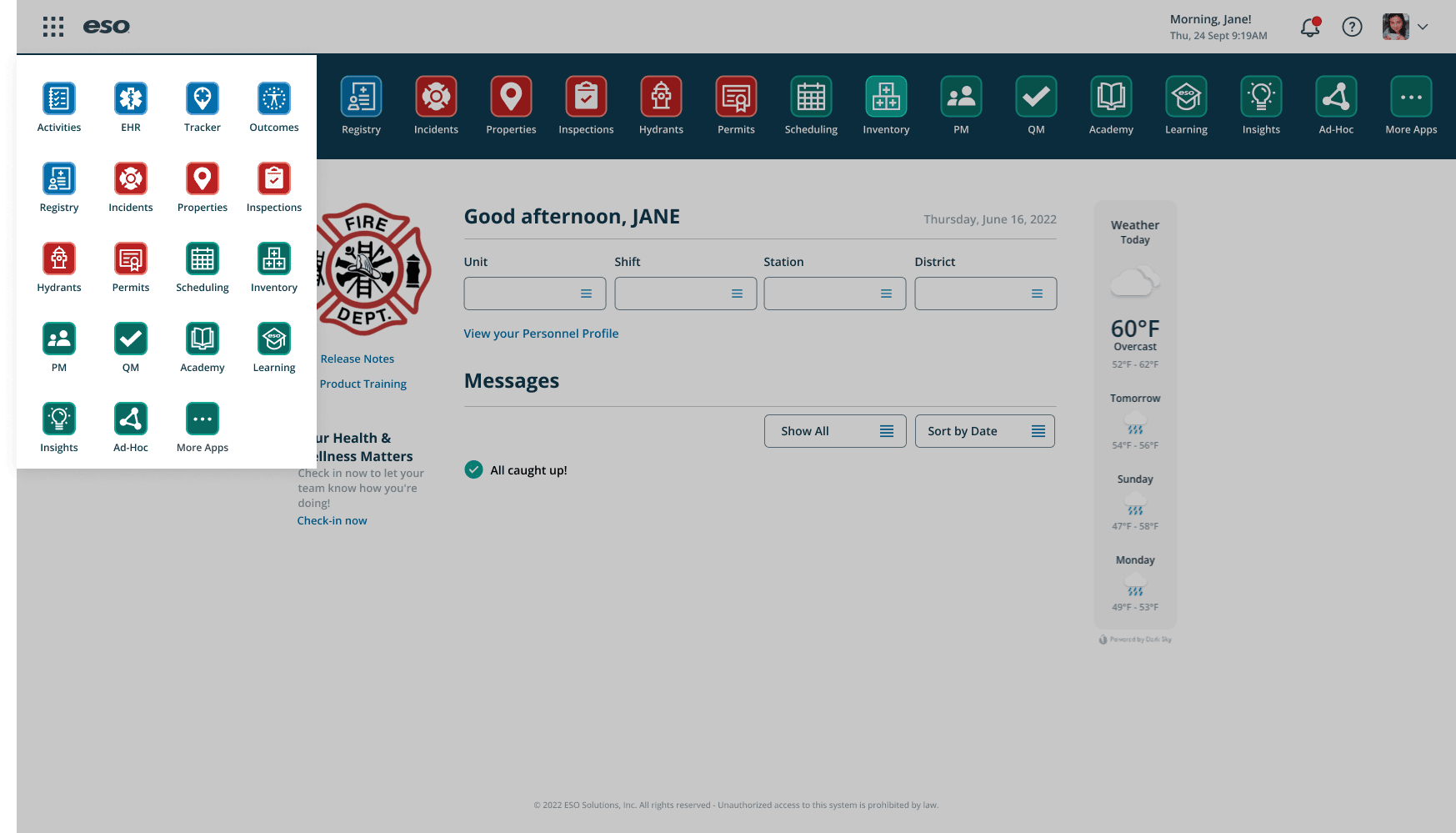
Project 1: Training Pages Redesign
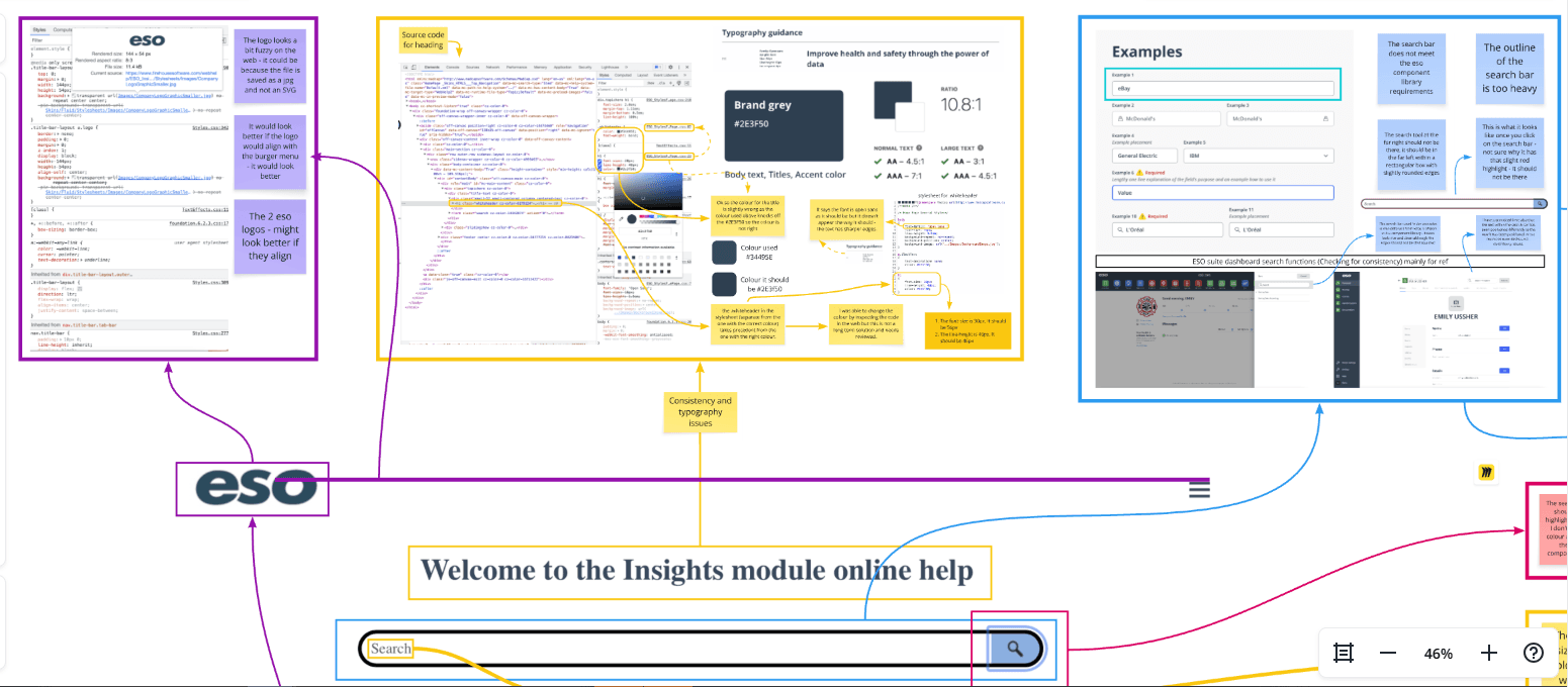
Context
One of my first tasks at eso was to evaluate and redesign the Training Pages — an internal knowledge hub that users often struggled to navigate due to dense layouts and overwhelming content.
Problem
Users couldn’t easily find the information they needed. The content structure lacked hierarchy and visual clarity, which made an already large amount of information feel even more complex.
Process
I began by conducting a heuristic evaluation to pinpoint usability issues. Working with a small team that didn’t have a dedicated designer, I volunteered to support them alongside my primary team.
This required stepping out of my comfort zone — I even dipped into front-end code to ensure that my design recommendations were practical and easy to implement.
Solution
I proposed a simplified layout, clearer navigation hierarchy, and consistent visual language. These updates improved readability and allowed users to locate information quickly and intuitively.
Impact
After implementing my recommendations, the team noticed fewer support queries and smoother navigation across the pages.
The project strengthened my analytical thinking and sparked a deeper interest in UX evaluation and problem-solving.
Software: Figma, Miro, HTML/CSS (light coding)
Skills: Heuristic Evaluation, Information Architecture, Accessibility, UX Problem-Solving, Cross-team Collaboration
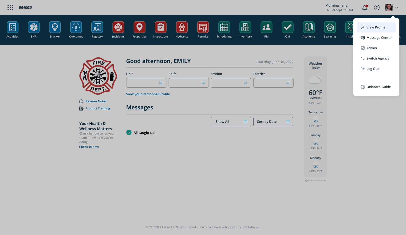
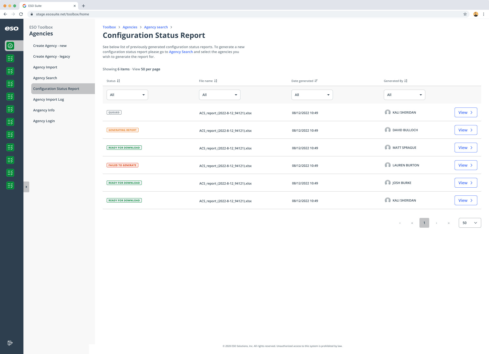
Project 2: eso Suite and Tools (EST)
Context
The EST team was where I spent most of my placement — and I was their first designer. The team was primarily engineers, so I quickly learned the importance of advocating for the user and translating between technical and design perspectives.
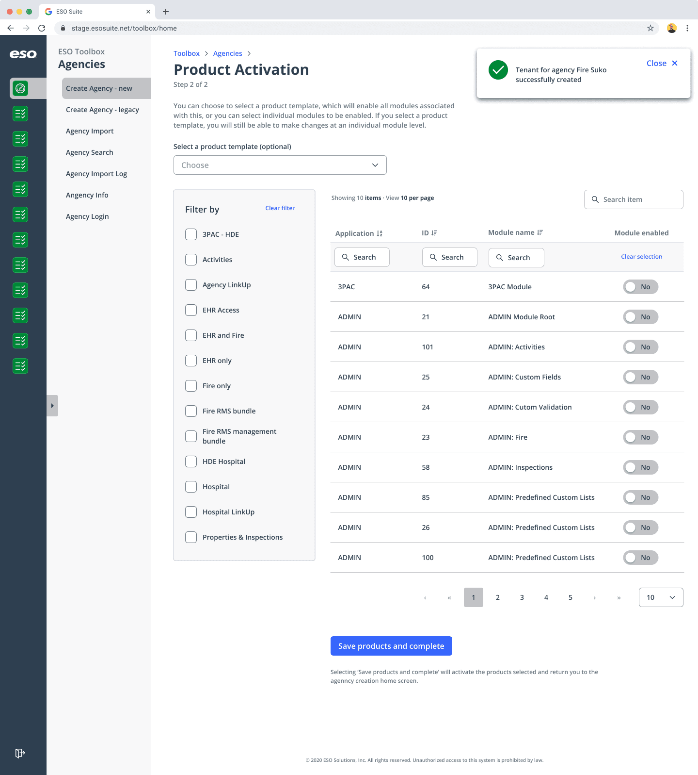
Problem
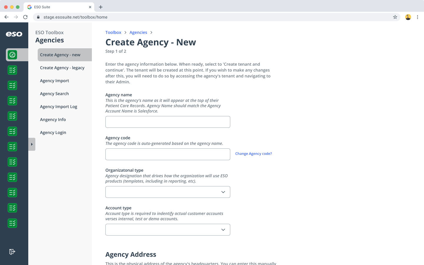
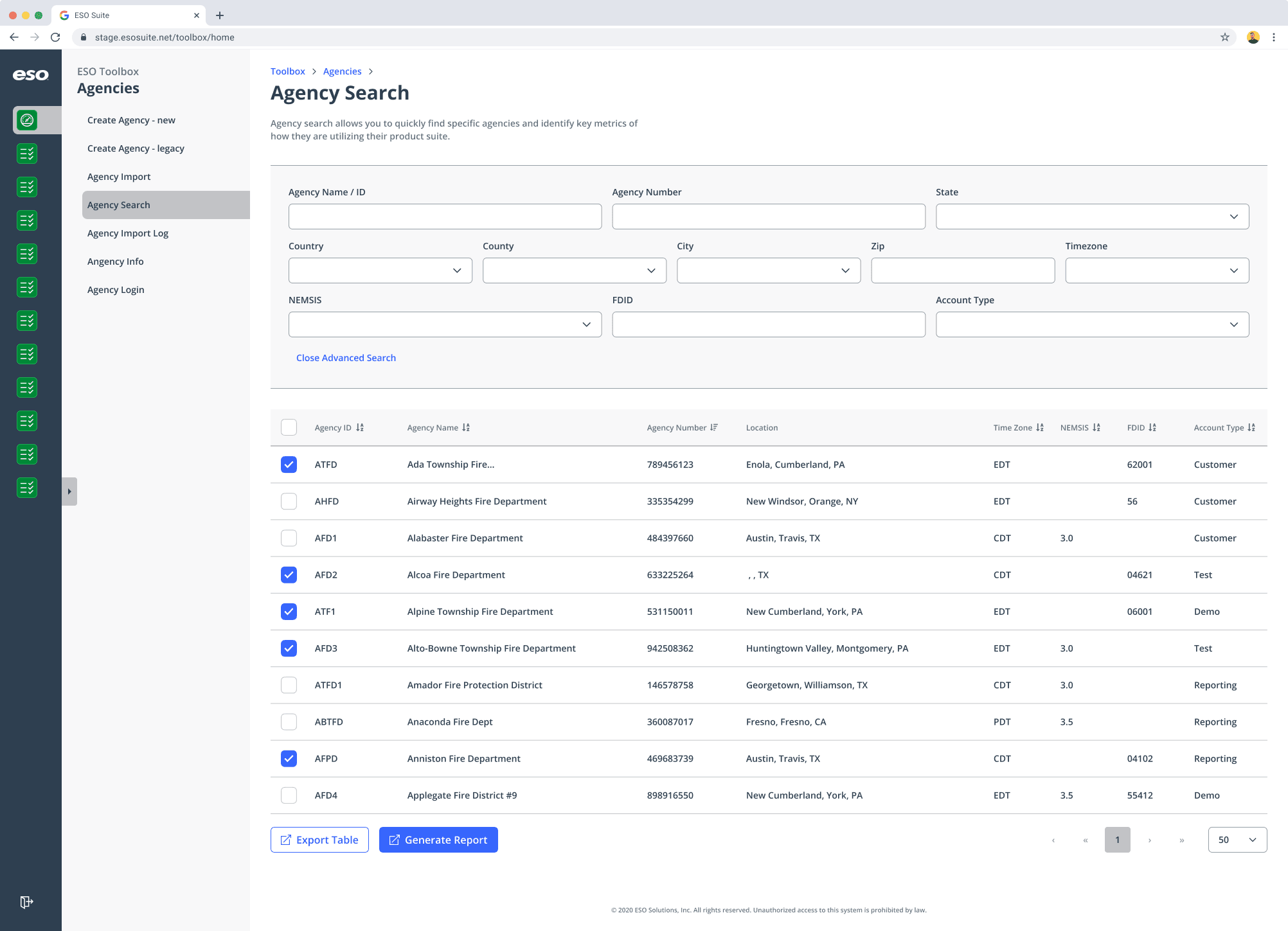
The team was developing Toolbox, a brand-new internal tool used by eso employees to manage customer accounts. With no established design system or UX foundation, I needed to help define the product’s look, feel, and usability from scratch.
Process
Collaborated closely with engineers to map out user journeys and information flows
Created low-fidelity wireframes and interactive prototypes in Figma
Championed accessibility and simplicity across the product
Introduced consistent UI patterns and scalable design components
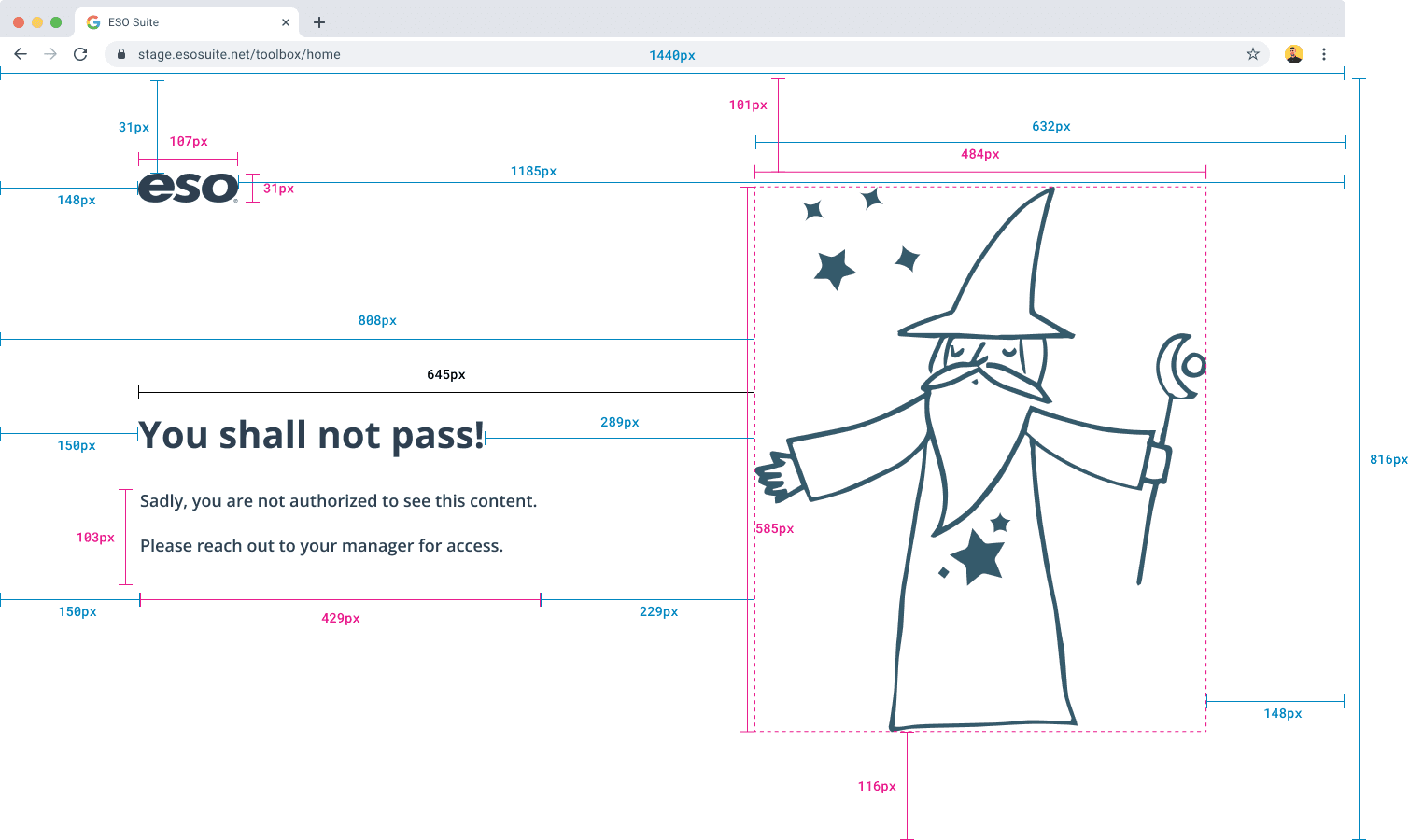
Key Contributions
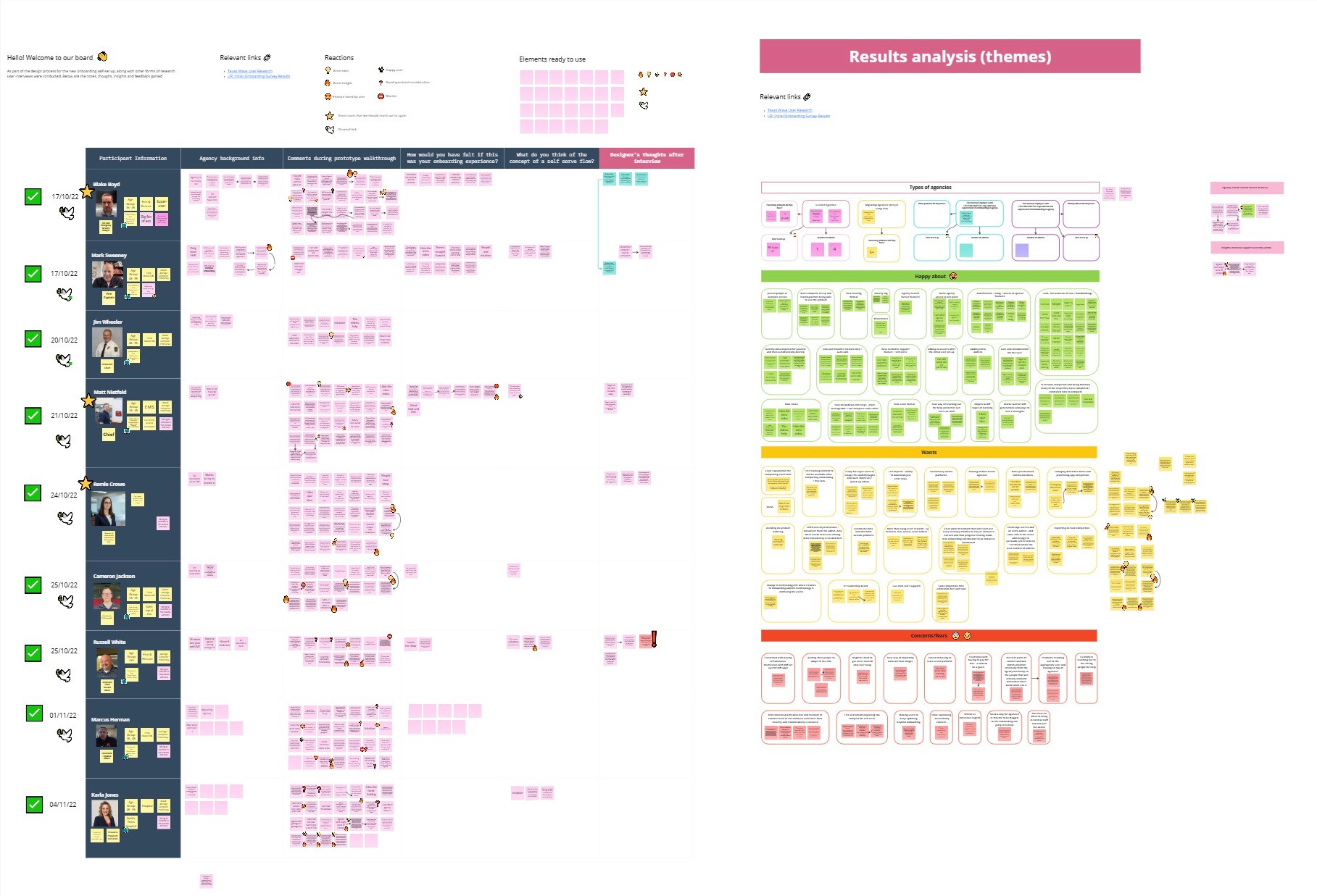
Error screen design: One of the first screens I designed, which helped establish the tone and visual identity for the product.
Agency onboarding flow: After user research, I introduced a “shopping cart” concept that allowed users to select multiple accounts and generate reports simultaneously — simplifying a previously complex process.
Navigation system redesign: I streamlined multiple paths into a clear, intuitive structure that reduced cognitive load and made future scaling easier.
Impact
My work helped establish a design foundation for a growing product, improving usability and setting a precedent for accessible, user-first design within a technical team.
This experience also strengthened my ability to communicate design rationale and collaborate across disciplines.
Software: Figma, Dovetail, Miro, Maze, Jira
Skills: Design Systems, Component Documentation, UI Consistency, Cross-Functional Collaboration, Accessibility Standards
PROJECT 3: COMPONENT LIBRARY DEVELOPMENT
Context
As Toolbox grew, I introduced several new UI components. To ensure consistency and scalability, I documented and added them to the company’s component library.
Process
This was my first experience managing design documentation at this scale. I spent time researching best practices, collaborating with senior designers, and ensuring each component was accessible and reusable.
Impact
Building out the library helped streamline future design work across teams and deepened my understanding of design systems thinking — a skill that’s since become invaluable in my final-year projects.
“Creating for scalability changed the way I think about design — it’s not just about what looks good today, but what will still work a year from now.”
Software: Figma, Dovetail, Miro, Jira
Skills: Design Systems, Component Documentation, UI Consistency, Cross-Functional Collaboration, Accessibility Standards
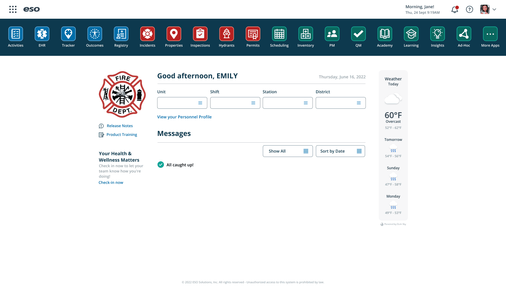
PROJECT 4: DASHBOARD UPDATES & RELEASE NOTES
Context
For one sprint, I worked on the main dashboard interface, introducing a new way to recommend apps that users hadn’t yet purchased.
Problem
The existing dashboard lacked discoverability for other products without feeling sales-heavy. It also needed visual consistency and improved navigation.
Process
I explored several layout options in Figma, focusing on balance — making recommendations visible but not intrusive. I also reorganized the navigation, refined colour coding for product categories, and tidied up the interface for a cleaner look.
Once the updates were ready, I conducted user tests to gather feedback.
Solution
The new design introduced subtle product discovery, clear visual hierarchy, and smoother navigation.
Impact
User feedback was overwhelmingly positive — testers found the dashboard easier to use and more intuitive.
This project gave me a deeper appreciation for how small UX refinements can have a big impact on user satisfaction.
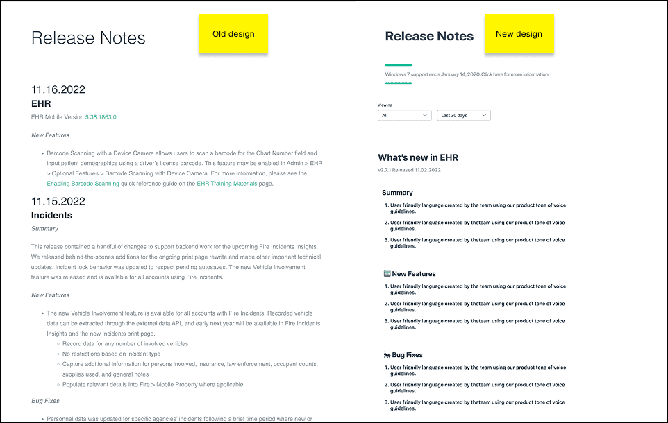
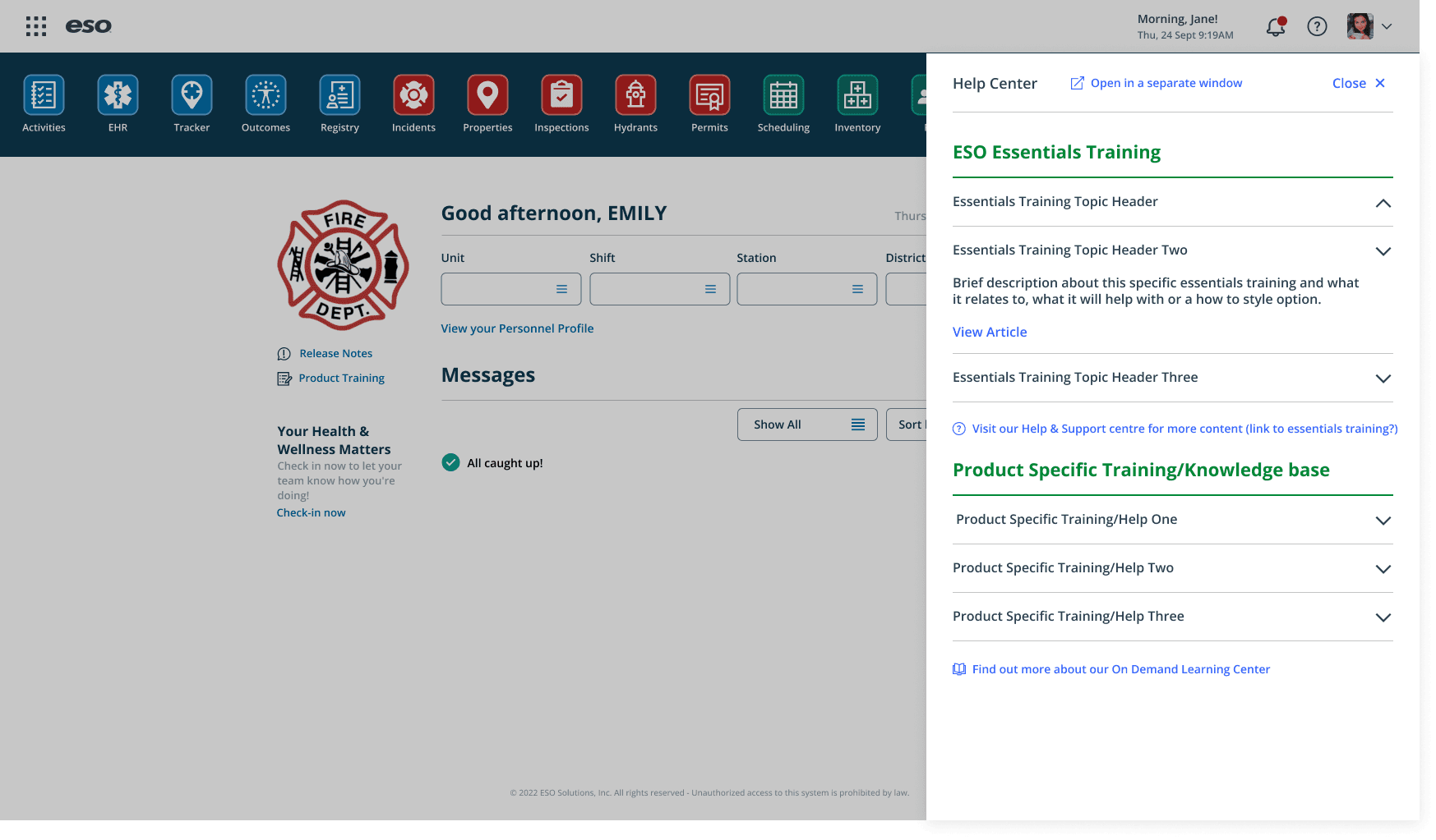
Release Notes Redesign
Around the same time, I redesigned the Release Notes page. This required both design and code work.
I focused on improving readability through better information hierarchy, filters, and a search function. The end result was a more accessible, modern experience that made scanning and referencing updates effortless.
loved the mix of design and front-end work — seeing my designs come to life gave me a new appreciation for implementation.
Software: Figma, Maze, HTML/CSS, Adobe Illustrator, Jira
Skills: UI Redesign, Prototyping, User Testing, Information Hierarchy, Interaction Design, Visual Consistency
Placement report and presentation

More Projects


UI / UX Design
ESO - PLACEMENT YEAR
During my placement year at eso, I had the opportunity to work across a wide range of projects — from web design to UX research — each challenging me in new ways. These experiences helped me grow rapidly as a designer and taught me how to balance creativity, collaboration, and technical constraints. Here you will find an overview of some of the key projects I contributed to during my time at eso.
Year :
2022 - 2023
Industry :
Tech & healthcare
Client :
eso
Project Duration :
1 year
Project 1: Training Pages Redesign
Context
One of my first tasks at eso was to evaluate and redesign the Training Pages — an internal knowledge hub that users often struggled to navigate due to dense layouts and overwhelming content.
Problem
Users couldn’t easily find the information they needed. The content structure lacked hierarchy and visual clarity, which made an already large amount of information feel even more complex.
Process
I began by conducting a heuristic evaluation to pinpoint usability issues. Working with a small team that didn’t have a dedicated designer, I volunteered to support them alongside my primary team.
This required stepping out of my comfort zone — I even dipped into front-end code to ensure that my design recommendations were practical and easy to implement.
Solution
I proposed a simplified layout, clearer navigation hierarchy, and consistent visual language. These updates improved readability and allowed users to locate information quickly and intuitively.
Impact
After implementing my recommendations, the team noticed fewer support queries and smoother navigation across the pages.
The project strengthened my analytical thinking and sparked a deeper interest in UX evaluation and problem-solving.
Software: Figma, Miro, HTML/CSS (light coding)
Skills: Heuristic Evaluation, Information Architecture, Accessibility, UX Problem-Solving, Cross-team Collaboration
Project 2: eso Suite and Tools (EST)
Context
The EST team was where I spent most of my placement — and I was their first designer. The team was primarily engineers, so I quickly learned the importance of advocating for the user and translating between technical and design perspectives.
Problem
The team was developing Toolbox, a brand-new internal tool used by eso employees to manage customer accounts. With no established design system or UX foundation, I needed to help define the product’s look, feel, and usability from scratch.
Process
Collaborated closely with engineers to map out user journeys and information flows
Created low-fidelity wireframes and interactive prototypes in Figma
Championed accessibility and simplicity across the product
Introduced consistent UI patterns and scalable design components
Key Contributions
Error screen design: One of the first screens I designed, which helped establish the tone and visual identity for the product.
Agency onboarding flow: After user research, I introduced a “shopping cart” concept that allowed users to select multiple accounts and generate reports simultaneously — simplifying a previously complex process.
Navigation system redesign: I streamlined multiple paths into a clear, intuitive structure that reduced cognitive load and made future scaling easier.
Impact
My work helped establish a design foundation for a growing product, improving usability and setting a precedent for accessible, user-first design within a technical team.
This experience also strengthened my ability to communicate design rationale and collaborate across disciplines.
Software: Figma, Dovetail, Miro, Maze, Jira
Skills: Design Systems, Component Documentation, UI Consistency, Cross-Functional Collaboration, Accessibility Standards
PROJECT 3: COMPONENT LIBRARY DEVELOPMENT
Context
As Toolbox grew, I introduced several new UI components. To ensure consistency and scalability, I documented and added them to the company’s component library.
Process
This was my first experience managing design documentation at this scale. I spent time researching best practices, collaborating with senior designers, and ensuring each component was accessible and reusable.
Impact
Building out the library helped streamline future design work across teams and deepened my understanding of design systems thinking — a skill that’s since become invaluable in my final-year projects.
“Creating for scalability changed the way I think about design — it’s not just about what looks good today, but what will still work a year from now.”
Software: Figma, Dovetail, Miro, Jira
Skills: Design Systems, Component Documentation, UI Consistency, Cross-Functional Collaboration, Accessibility Standards
PROJECT 4: DASHBOARD UPDATES & RELEASE NOTES
Context
For one sprint, I worked on the main dashboard interface, introducing a new way to recommend apps that users hadn’t yet purchased.
Problem
The existing dashboard lacked discoverability for other products without feeling sales-heavy. It also needed visual consistency and improved navigation.
Process
I explored several layout options in Figma, focusing on balance — making recommendations visible but not intrusive. I also reorganized the navigation, refined colour coding for product categories, and tidied up the interface for a cleaner look.
Once the updates were ready, I conducted user tests to gather feedback.
Solution
The new design introduced subtle product discovery, clear visual hierarchy, and smoother navigation.
Impact
User feedback was overwhelmingly positive — testers found the dashboard easier to use and more intuitive.
This project gave me a deeper appreciation for how small UX refinements can have a big impact on user satisfaction.
Release Notes Redesign
Around the same time, I redesigned the Release Notes page. This required both design and code work.
I focused on improving readability through better information hierarchy, filters, and a search function. The end result was a more accessible, modern experience that made scanning and referencing updates effortless.
loved the mix of design and front-end work — seeing my designs come to life gave me a new appreciation for implementation.
Software: Figma, Maze, HTML/CSS, Adobe Illustrator, Jira
Skills: UI Redesign, Prototyping, User Testing, Information Hierarchy, Interaction Design, Visual Consistency
Placement report and presentation
More Projects
UI / UX Design
ESO - PLACEMENT YEAR
During my placement year at eso, I had the opportunity to work across a wide range of projects — from web design to UX research — each challenging me in new ways. These experiences helped me grow rapidly as a designer and taught me how to balance creativity, collaboration, and technical constraints. Here you will find an overview of some of the key projects I contributed to during my time at eso.
Year :
2022 - 2023
Industry :
Tech & healthcare
Client :
eso
Project Duration :
1 year
Project 1: Training Pages Redesign
Context
One of my first tasks at eso was to evaluate and redesign the Training Pages — an internal knowledge hub that users often struggled to navigate due to dense layouts and overwhelming content.
Problem
Users couldn’t easily find the information they needed. The content structure lacked hierarchy and visual clarity, which made an already large amount of information feel even more complex.
Process
I began by conducting a heuristic evaluation to pinpoint usability issues. Working with a small team that didn’t have a dedicated designer, I volunteered to support them alongside my primary team.
This required stepping out of my comfort zone — I even dipped into front-end code to ensure that my design recommendations were practical and easy to implement.
Solution
I proposed a simplified layout, clearer navigation hierarchy, and consistent visual language. These updates improved readability and allowed users to locate information quickly and intuitively.
Impact
After implementing my recommendations, the team noticed fewer support queries and smoother navigation across the pages.
The project strengthened my analytical thinking and sparked a deeper interest in UX evaluation and problem-solving.
Software: Figma, Miro, HTML/CSS (light coding)
Skills: Heuristic Evaluation, Information Architecture, Accessibility, UX Problem-Solving, Cross-team Collaboration
Project 2: eso Suite and Tools (EST)
Context
The EST team was where I spent most of my placement — and I was their first designer. The team was primarily engineers, so I quickly learned the importance of advocating for the user and translating between technical and design perspectives.
Problem
The team was developing Toolbox, a brand-new internal tool used by eso employees to manage customer accounts. With no established design system or UX foundation, I needed to help define the product’s look, feel, and usability from scratch.
Process
Collaborated closely with engineers to map out user journeys and information flows
Created low-fidelity wireframes and interactive prototypes in Figma
Championed accessibility and simplicity across the product
Introduced consistent UI patterns and scalable design components
Key Contributions
Error screen design: One of the first screens I designed, which helped establish the tone and visual identity for the product.
Agency onboarding flow: After user research, I introduced a “shopping cart” concept that allowed users to select multiple accounts and generate reports simultaneously — simplifying a previously complex process.
Navigation system redesign: I streamlined multiple paths into a clear, intuitive structure that reduced cognitive load and made future scaling easier.
Impact
My work helped establish a design foundation for a growing product, improving usability and setting a precedent for accessible, user-first design within a technical team.
This experience also strengthened my ability to communicate design rationale and collaborate across disciplines.
Software: Figma, Dovetail, Miro, Maze, Jira
Skills: Design Systems, Component Documentation, UI Consistency, Cross-Functional Collaboration, Accessibility Standards
PROJECT 3: COMPONENT LIBRARY DEVELOPMENT
Context
As Toolbox grew, I introduced several new UI components. To ensure consistency and scalability, I documented and added them to the company’s component library.
Process
This was my first experience managing design documentation at this scale. I spent time researching best practices, collaborating with senior designers, and ensuring each component was accessible and reusable.
Impact
Building out the library helped streamline future design work across teams and deepened my understanding of design systems thinking — a skill that’s since become invaluable in my final-year projects.
“Creating for scalability changed the way I think about design — it’s not just about what looks good today, but what will still work a year from now.”
Software: Figma, Dovetail, Miro, Jira
Skills: Design Systems, Component Documentation, UI Consistency, Cross-Functional Collaboration, Accessibility Standards
PROJECT 4: DASHBOARD UPDATES & RELEASE NOTES
Context
For one sprint, I worked on the main dashboard interface, introducing a new way to recommend apps that users hadn’t yet purchased.
Problem
The existing dashboard lacked discoverability for other products without feeling sales-heavy. It also needed visual consistency and improved navigation.
Process
I explored several layout options in Figma, focusing on balance — making recommendations visible but not intrusive. I also reorganized the navigation, refined colour coding for product categories, and tidied up the interface for a cleaner look.
Once the updates were ready, I conducted user tests to gather feedback.
Solution
The new design introduced subtle product discovery, clear visual hierarchy, and smoother navigation.
Impact
User feedback was overwhelmingly positive — testers found the dashboard easier to use and more intuitive.
This project gave me a deeper appreciation for how small UX refinements can have a big impact on user satisfaction.
Release Notes Redesign
Around the same time, I redesigned the Release Notes page. This required both design and code work.
I focused on improving readability through better information hierarchy, filters, and a search function. The end result was a more accessible, modern experience that made scanning and referencing updates effortless.
loved the mix of design and front-end work — seeing my designs come to life gave me a new appreciation for implementation.
Software: Figma, Maze, HTML/CSS, Adobe Illustrator, Jira
Skills: UI Redesign, Prototyping, User Testing, Information Hierarchy, Interaction Design, Visual Consistency